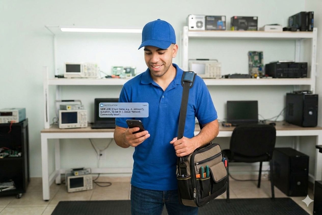
Pockit Engineers connects people with a broken laptop, router or Wi-Fi to a verified repair engineer — fast. I designed the complete Android onboarding: splash to first booking, in both light and dark, all driven by one Figma variable system.
The first 60 seconds decide the download
An on-demand IT repair service. Report a fault, get matched to a nearby verified engineer, and track the visit — from Wi-Fi outages to dead laptops.
- ■Onboarding is heavy — register, verify, address, permissions, schedule
- ■Trust must be earned early — strangers entering your home
- ■Two themes, 23 screens — kept identical without doubling the work
- ■Make a long flow feel like "start in seconds"
- ■Front-load proof: verified engineers, clear visit details
- ■One token system powering both themes from a single source
377 variables, one source of truth
Tap through the real flow
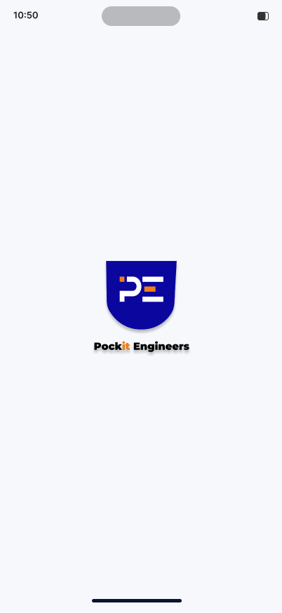
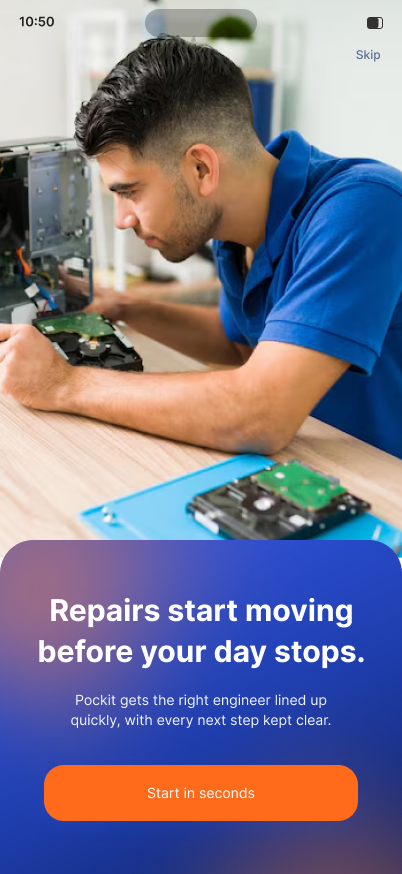
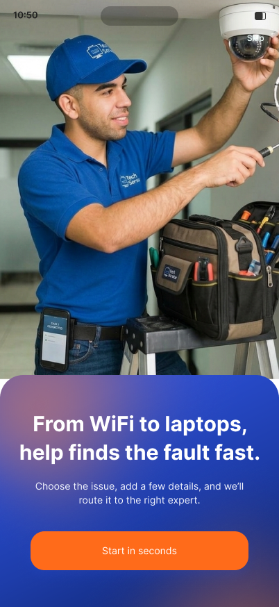
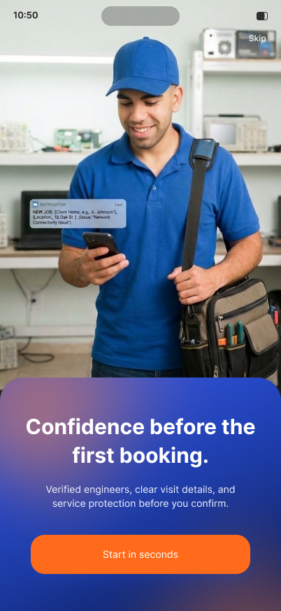
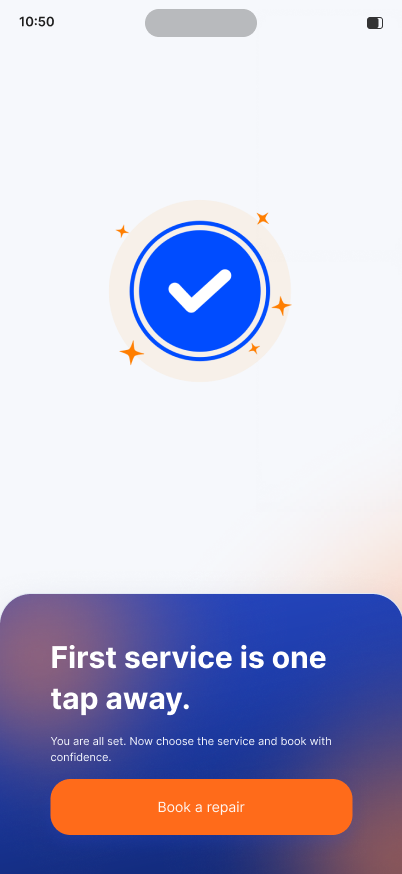
A quiet brand moment on a mist-light background — the shield mark sets the tone before anything is asked of the user.
Splash to first booking, mapped
Same screen, two modes, zero drift
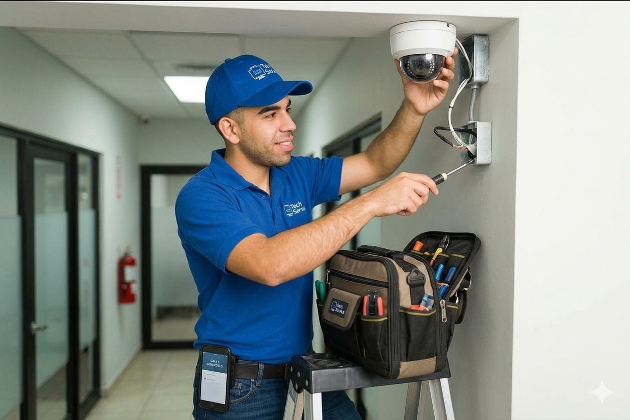
Because every surface, text and accent reads from a semantic token — not a raw hex — switching the theme mode re-skins all 11 steps at once. The orange CTA becomes brand blue in light mode; nothing else moves.
A flow that feels like seconds
screens designed across light and dark
Figma variables across 7 collections
themes from one component library
- ■Big photography + a dark panel does the emotional work; the copy just has to be short and confident.
- ■A deep primitive → semantic token split is what makes two full themes affordable.
- ■Onboarding is a trust funnel — every screen either adds proof or removes a step.
- ■Wire the Figma variables to Jetpack Compose theme tokens.
- ■Design the engineer-facing side of the marketplace.
- ■Usability test the register → OTP → address drop-off.
A 23-screen, two-theme onboarding that makes a heavy sign-up feel like it takes seconds — every pixel traceable to one of 377 tokens.