A travel-packing app built around a Sudoku-style 3×3 wardrobe grid — designed as a full token-based design system in Figma and implemented 1:1 in React Native.
PACKR is for travelers who want capsule-wardrobe results without capsule-wardrobe discipline. Add nine items to a 3×3 grid — three tops, three bottoms, three layers — and PACKR generates every wearable combination, tracks carry-on weight, and turns the result into a packing checklist.
Why does packing still feel like guesswork?
A mobile app for travelers chasing capsule-wardrobe results without the discipline. Nine items become a generated set of outfits, a live weight budget, and a packing checklist.
Packing apps solve lists, not outfits. Travelers pack items, then discover mid-trip nothing combines.
- ■Overpacking — "just in case" items never worn
- ■Decision fatigue — outfit math done in your head
- ■No feedback — nothing warns the bag is over the limit
Design a system where constraints do the thinking:
- ■Make 9 items feel like enough — prove the 27 combinations visually
- ■Surface weight and completeness as you build, not at the airport
- ■Build it as a real token-based system, implemented 1:1 in code
Three bets, made before pixels
Limit users to a 3×3 grid and they pack fewer items and wear more of them — because the system proves 9 items already cover 27 outfit combinations.
If carry-on weight is visible on every build screen — not calculated at the end — users self-correct before overpacking, instead of repacking at the airport.
If the grid shows what's missing ("Row B incomplete — 2 items needed"), users finish setup. Empty-state ambiguity, not laziness, is why wardrobe apps get abandoned.
Lightweight, but honest
- ■Conversations with frequent travelers — how they decide what to pack, what they regret, how they judge "enough."
- ■Teardown of existing tools — PackPoint, Stylebook, Whering, and the spreadsheet workflows people actually use.
- ■Self-testing — packed for real trips with a paper 3×3 grid before designing a screen. The "Sudoku" rules come from what failed.
"I pack outfits in my head, then forget the math."
Nothing external holds the combination state — so people re-derive it, badly, while packing.
"Half my bag never gets worn."
Items are packed as individuals, not combinations — single-use pieces sneak in unexposed.
"I only find out it's overweight at check-in."
Weight is a checkout surprise, not a design constraint.
The Sudoku method — try it
Every cell must combine with every cell in the other rows — like Sudoku, a cell is only "valid" in relation to its neighbors. Fill the grid to see 9 items become 27 outfits.
Lists, closets, or math — pick one
| PACKR | PackPoint | Stylebook / Whering | Notes / sheets | |
|---|---|---|---|---|
| Core model | 3×3 outfit grid → generated looks | Auto checklists from trip type | Full closet catalog, manual outfits | Freeform lists |
| Outfit logic | Combinatorial — 9 items = 27 looks | None — items only | Manual pairing | In your head |
| Weight budget | Live kg tracker vs airline limit | No | No | Manual |
| Definition of done | Grid complete + all packed | List checked off | Never — it's a closet | None |
The gap: nobody treats packing as a combinatorics problem with a weight constraint. That's the whole product.
Tokens first, screens second
Two families only. Mono carries all labels, stats, and system voice — the UI reads like an instrument panel.
No hardcoded values in components. Primitives → semantic → component tokens. Every Figma variable exists in code.
Build, generate, believe
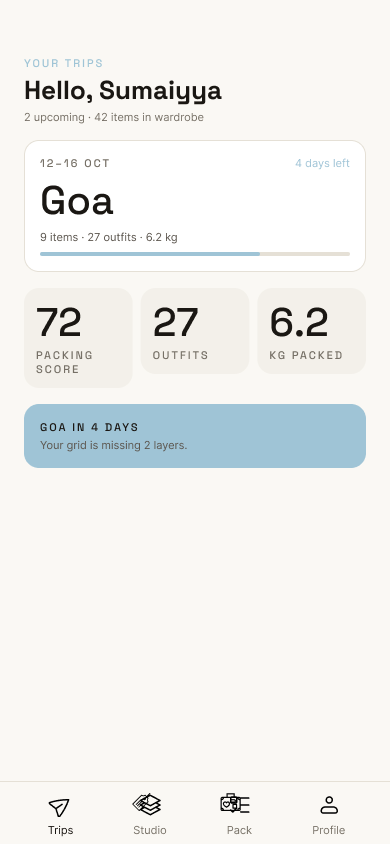
Trips as progress objects — grid % complete, days left, carry-on weight — plus lifetime wardrobe stats.
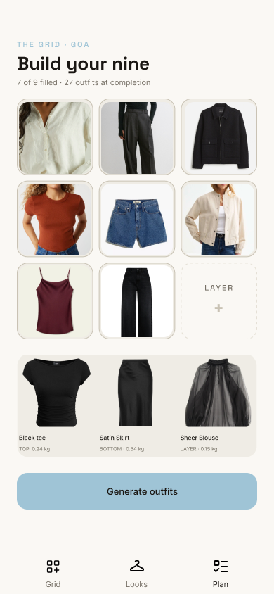
The 3×3 matrix with a live compatibility score. Incomplete rows warn in amber: "Row B incomplete — 2 items needed."
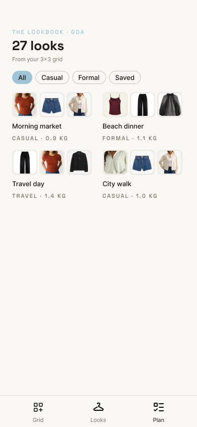
The payoff screen: every generated outfit, filterable, saveable, shareable. This convinces the Overpacker that 9 items are enough.
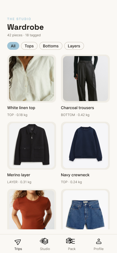
Add items by photo — AI removes the background and detects the palette (2 neutral · 2 hero · 1 accent). Cataloging cost stays near zero.
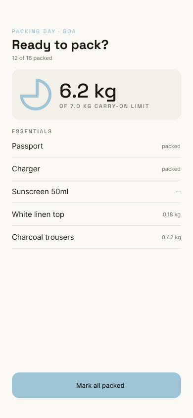
The grid becomes a checklist with per-item weights. The kg bar stays green while you're carry-on safe — weight is ambient (H2).
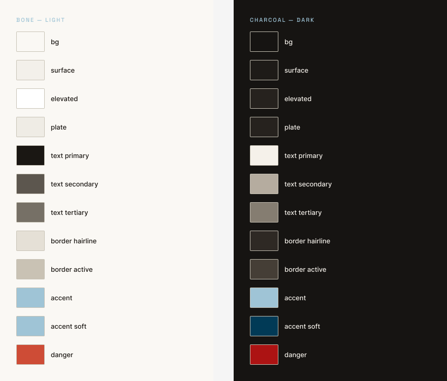
The system's source of truth in Figma — colors, type scale, and spacing as variables, mirrored one-to-one in code.
One source of truth, zero drift
// tokens.ts — mirrors Figma variable collections
export const color = {
  bg: '#0C0C0E',      surface: '#18181B',
  accent: '#9CDCA5',  warning: '#F4B25B',
};
export const space = [0, 4, 8, 12, 16, 24, 32, 40];
export const type  = { pageTitle: 30, cardTitle: 18, body: 13 };
- ■Design QA is a diff, not a debate — if the build looks wrong, a token is wrong.
- ■Dark theme shipped free — semantic tokens meant zero component changes.
- ■The Figma file is documentation — every value in code traces to a named variable.
Every value traced, nothing improvised
looks from 9 items — the math holds in real packing
hardcoded style values in the React Native build
type families · 10 semantic colors · one 4pt scale
- ■Constraint is a feature — the 3×3 grid is the UX; every screen just renders its state.
- ■Building the token pipeline before screens felt slow, and made every later screen faster. Systems compound.
- ■Implementing my own design exposed my own ambiguity: every untokenized value became a decision made twice.
- ■Packing algorithm v2 — weather- and occasion-aware slot suggestions
- ■Shared lookbooks — publish a trip grid as a template
- ■Usability round with travelers to properly test H1–H3
Nine items, twenty-seven outfits, one carry-on — a constraint turned into a product, and a design system that made the build a diff instead of a debate.